With the WordPress default resizing system, images can be used at specific locations, have the correct sizes, use less space and be used in a responsive manner.
Table of contents
Introduction to the default WordPress image sizes
WordPress has made a lot of advances in keeping up to date with web design principles, best practices and mobile responsiveness. Automatic features include image resizing, responsive images and large image handling.
In this post, we will look at default WordPress image sizes and additional image sizes. It is meant to serve as an introduction and basis to other WordPress image size-related posts.
- Get the ROCCAT Burst Pro PC Gaming Mouse from Amazon.com
- Get the Corsair K95 RGB Platinum XT Mechanical Gaming Keyboard from Amazon.com
- Get the LG 22MK430H-B 21.5″ Full HD Monitor from Amazon.com
Default WordPress image sizes
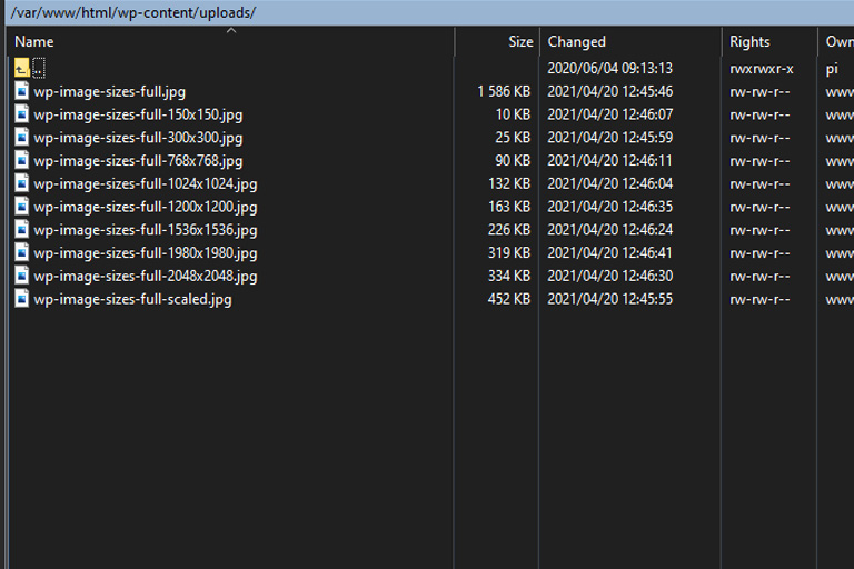
By default, WordPress will automatically resize images that were uploaded using the Media Library. The original copy of the image (Full image size), together with all the resized copies are then stored in the/wp-content/uploads/ directory.
In this example, an image named wp-image-sizes-full.jpg that was 3000 x 3000 px was uploaded using a fresh install of WordPress and the TwentyTwenty theme. No additional plugins were activated.

An example where WordPress automatically resized an uploaded image to various sizes. The TwentyTwenty WP theme was used while uploading the original image.
WordPress uses basic rules to resize images. Image resizing will only take place when the image dimensions of the Full image are larger than the set image sizes. If either the height or the width is larger, the image will be resized.
Upon deleting an image from the Media Library (by using the Delete Permanently link), all the default size variations of the image will also be removed.
To get a better understanding of where, when and how images are resized we will be looking at the basic WordPress image sizes, responsive image support image sizes and large image handling image sizes.
Basic default WordPress image sizes
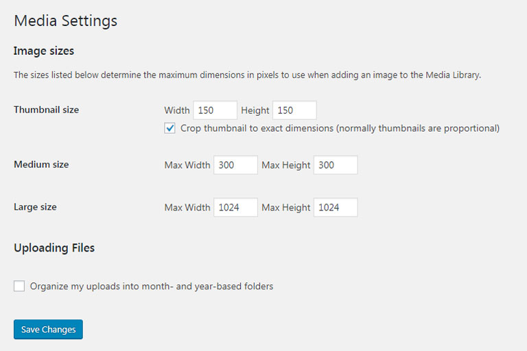
The first set of default image sizes is the basic image sizes. WordPress has 3 basic image sizes. They are:
- Thumbnail size (150 x 150 pixels)
- Medium size (300 x 300 pixels)
- Large size (1024 x 1024 pixels)

The three basic default WordPress image sizes are shown in the Media Settings (Settings -> Media). They are the Thumbnail size, Medium size and Large size.
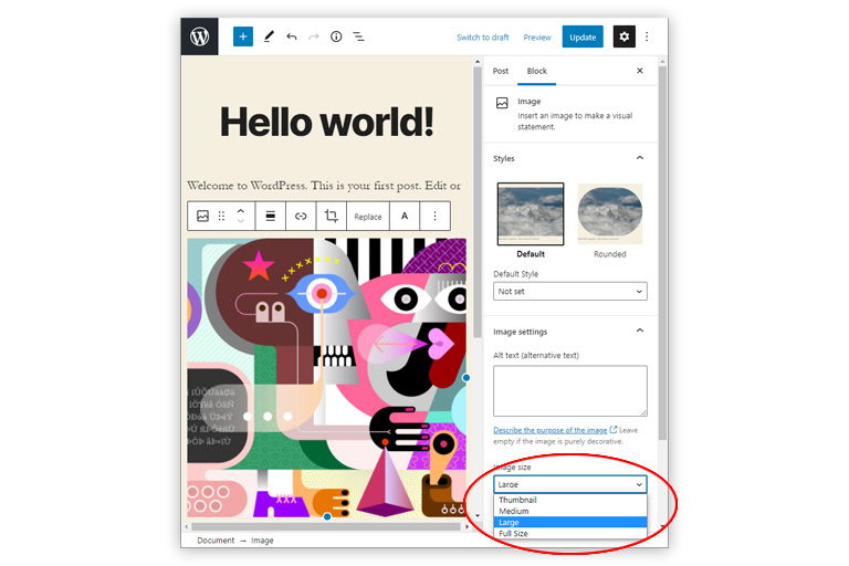
The original image and these three basic size variations will be selectable from the WordPress Editor.

Showing the image size related settings in the WordPress Post Editor. Image Settings for Gutenberg shows the basic default WordPress image sizes on the drop-down list.

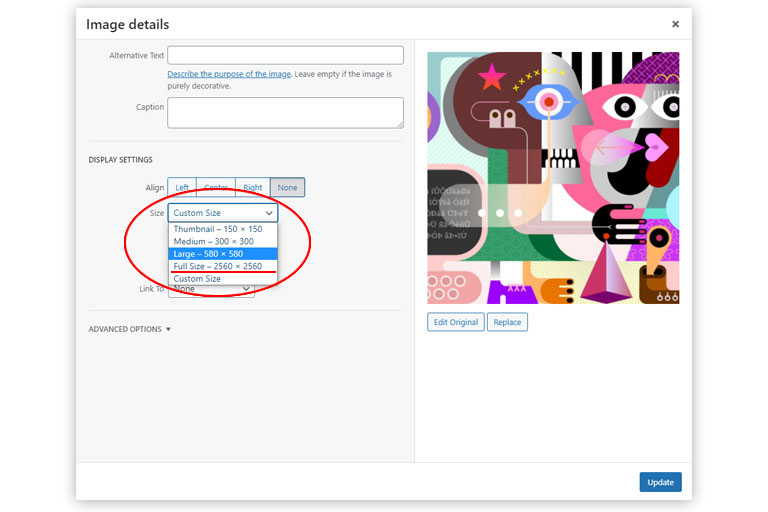
The Image Attachment Display Settings for Classic Editor show the default WordPress image sizes on their drop-down list. The Classic Editor also has an option for setting a Custom Size.
Apart from the ability to use the basic default image sizes via the WordPress Editor, some sizes will also be used by WordPress itself. For example, the Medium image size is used by the Media Library to display uploaded images.
Responsive image support image sizes
In addition to the Thumbnail size, Medium size and Large size, WordPress also generates responsive image support image sizes. These include the Medium Large size (768 pixels wide), 2x Medium Large size (1536 pixels wide) and 2x Large size (2048 pixels wide).
These sizes, in combination with the Big image size (see later) and the default image sizes (see earlier), will allow responsive themes to automatically have more appropriate-sized images for web browsers to choose from.
The Medium Large size was introduced in WordPress 4.4 together with their responsive feature. This image size is often used for in-post images on large displays.
The instructions for creating the Medium Large image size is defined in the wp-admin/includes/schema.php file (starting at line 522):
// 4.4.0
'medium_large_size_w'             => 768,
'medium_large_size_h'             => 0,
and are requested in the wp-admin/includes/image.php file.
The 2x Medium Large and 2x Large sizes were introduced in WordPress 5.3 together with their large image handling functionality. They are meant to enhance the way images are displayed on larger, high-density devices.
The instructions for creating the 2x Medium Large 2x Large image sizes are defined in the wp-includes/media.php file (starting at line 4941):
/**
 * Add additional default image sub-sizes.
 *
 * These sizes are meant to enhance the way WordPress displays images on the front-end on larger,
 * high-density devices. They make it possible to generate more suitable `srcset` and `sizes` attributes
 * when the users upload large images.
 *
 * The sizes can be changed or removed by themes and plugins but that is not recommended.
 * The size "names" reflect the image dimensions, so changing the sizes would be quite misleading.
 *
 * @since 5.3.0
 * @access private
 */
function _wp_add_additional_image_sizes() {
	// 2x medium_large size.
	add_image_size( '1536x1536', 1536, 1536 );
	// 2x large size.
	add_image_size( '2048x2048', 2048, 2048 );
}
Large image handling image sizes
Now that we know where the Thumbnail size, Medium size, Large size, Medium Large size, 2x Medium Large size and 2x Large size comes from, let’s have a look at the scaled file.
As mentioned above, WordPress 5.3 also improved its large image handling functionality. Large images are often much bigger than needed (e.g. larger than 2MB with huge pixel dimensions) and are not optimised for web use. WordPress detects these images and generates a “web-optimised maximum size” of them — called Big image size.
The Big image size default is 2560px. The threshold is used as the max-height and max-width value to scale down the image for use as the largest available size.
This feature prevents the original image from being used when selecting the image size from the Image Attachment Display settings (Classic Editor) or the Image Settings (Gutenberg Editor).

The Attachment Display Settings from the Classic WordPress Editor showing that the Full Size is only 2560 x 2560 px and not 3000 x 3000 px.
Additional image sizes
Remember that it was mentioned that the TwentyTwenty theme was used while uploading the original image. The last two images saved in the /wp-content/uploads/ directory (1200px and 1280px) were resized images which resize dimensions were set by functions in the TwentyTwenty theme.
Additional image sizes will be theme and plugin dependant and are usually set in the plugin-name.php or the theme’s functions.php file. In the TwentyTwenty theme, the instructions for creating the additional image sizes are defined in the functions.php file (starting at line 53):
/*
	 * Enable support for Post Thumbnails on posts and pages.
	 *
	 * @link https://developer.wordpress.org/themes/functionality/featured-images-post-thumbnails/
	 */
	add_theme_support( 'post-thumbnails' );

	// Set post thumbnail size.
	set_post_thumbnail_size( 1200, 9999 );

	// Add custom image size used in Cover Template.
	add_image_size( 'twentytwenty-fullscreen', 1980, 9999 );
After additional image size dimensions were set, uploaded images will be automatically resized to those dimensions too.
Developers can set additional image sizes in child themes or custom plugins.
The lesser of two evils
By resizing images more space will be used on the website server. By using CSS attributes or HTML attributes, less server space is used, but loading times will be longer.
Bypassing image resizing
In cases where only the original size of an image is required, image resizing can be bypassed by manually uploading the image to the /wp-content/uploads/ directory using an FTP client (e.g. Eclipse or FileZilla).
A simple way would be, for example, to create a new directory in the /wp-content/uploads directory, e.g. /wp-content/uploads/singles.
Bypassing image resizing will mean that the image directory will have to be set manually each time the image is used.
Conclusion
By default, WordPress will save the original copy and various resized copies of an uploaded image file. These files are used in various places for various functions, to improve mobile responsiveness and save drive space.
Additional image sizes can be set using WordPress PHP functions. Image resizing can be bypassed, but built-in functionality will be lost.

