CSS transitions allow properties to change over time. I.e. elements can transition smoothly from one property value to another using the desired time interval.
Table of contents
Introduction to CSS transitions
CSS transitions are amongst the first types of ‘CSS animation effect’ many new CSS developers will come across. They are easy to use and understand while they can have a big impact on the look and feel of a web page.
In its simplest form, a transition allows the change of a CSS property from one value to another value over a certain period of time. In other words, they are used to control the animation speed when changing CSS properties.
The change will take place according to a pre-set speed curve (i.e timing-function) where the intermediate states are automatically calculated.
.transition {
  color: black;
  transition: color 1.5s ease-in;
}

.transition:hover {
  color: red;
The example above shows the shorthand of a simple CSS transition effect. Instead of changing instantaneously, the text colour of the element containing the .transition class, will transition from black to red over a period of 1.5 seconds when hovered upon. By using ease-in, the transition will start slow and end off at a steady speed.
Note that :hover effects are not possible on mobile devices.
Apart from using pseudo-classes, normal CSS classes, CSS transforms and JavaScript methods and events can also be used to add a CSS transition.
Colour (color) is not the only property that can be used for CSS transitions. Other properties such as font-size, background-color, opacity, text-decoration, margin, padding and many, many more can also be used.
- Get the ROCCAT Burst Pro PC Gaming Mouse from Amazon.com
- Get the Corsair K95 RGB Platinum XT Mechanical Gaming Keyboard from Amazon.com
- Get the LG 22MK430H-B 21.5″ Full HD Monitor from Amazon.com
Transitions vs. no transitions
CSS property changes are traditionally immediate. The example below uses the :hover pseudo class to change the background colour from red to grey:
By hovering over this block, the colour change is almost immediate (i.e. there is no transition over a period of time)
.example {
  background: red;
  width: 100%;
  margin-bottom: 30px;
  text-align: center;
  color: white;
  font-size: 2em;
}

.example:hover {
  color: grey;
By using CSS transition, the colour of the block can be changed over a period of time.
By hovering over this block, the colour turns from red to grey over a period of 1.5 seconds.
.example {
  background-color: red;
  width: 100%;
  margin-bottom: 30px;
  text-align: center;
  color: white;
  font-size: 2em;
  transition: background-color 1.5s;
}

.example:hover {
  background-color: grey;
}
Defining CSS transitions
CSS transitions define the transition between two states. In its simplest form, these states need to be within the same CSS property (e.g. color: red; to color: blue;). CSS properties are the ‘things’ within CSS selectors that values can be assigned to.
Both states need to be defined separately and the transition state needs to include the transition properties. A separate state can be triggered by, for example, using a seconds class, a CSS pseudoclass or element.style or element.classList.add methods in JavaScript.
Using the second example from above again:
.example {
  background-color: red;
  width: 100%;
  margin-bottom: 30px;
  text-align: center;
  color: white;
  font-size: 2em;
  transition: background-color 1.5s;
}

.example:hover {
  background-color: grey;
}
The .example class contains the CSS property of the original state (in this case background-color: red;). The transition state (.example:hover) indicated the state to where the desired property needs to transition too.
The transition properties are usually included in the class of the original state, but can also be added to the transition state if the original state is to be reverted back to.
JavaScript
In JavaScript, transition properties are defined using the element.style method:
element.style.transition = "background-color 1.5s";

or

element.style.transitionDuration = "2s";
JavaScript can also be used to add and remove classes by using the element.classList.add or element.classList.remove methods.
CSS transition properties
Transitions are done using CSS properties. In its simplest form, a CSS transition consist of 4 properties:
transition-property: <CSS property to transition>;
transition-duration: <time (in seconds) it will take for transition to complete>;
transition-timing-function: (optional, default ease) <curve transition will follow>;
transition-delay: (optional, default 0s) <time (in seconds) before transition will start>;
Alternatively, the shorthand transition property can be used as follows:
transition: <CSS property> <duration> <timing-fuction> (optional) <delay> (optional);
Transition property
The transition property is the CSS property that will be transitioned. A single property (e.g. transition-property: color;), all the properties (i.e. transition-property: all;), none of the properties (i.e. transition-property: none;) or multiple properties can be set.
Multiple CSS properties can be added by separating the CSS properties with a comma:
transition: <CSS property1>, <CSS property2> <duration> <timing-fuction> (optional) <delay> (optional);
Transition-duration property
The transition-duration property sets the amount of time (in seconds) the transition will take to occur.
Values can either be set as full or fractions (e.g. 0.1s, 1.2s or 2s).
Transition timing-function property
The third transition property is the transition timing function. This (optional) property sets the speed curve the transition will follow.
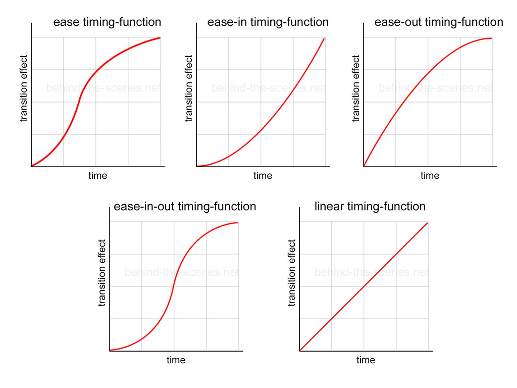
The five basic transition-timing-function properties are ease (default), ease-in, ease-out, ease-in-out and linear.

The five basic transition timing-function properties are ease, ease-in, ease-out, ease-in-out and linear.
The ease timing-function
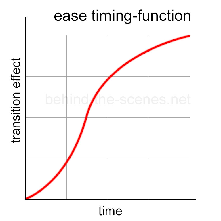
The default value for the transition timing function is ease. The ease transition-function starts slowly, accelerates in the middle, and slows down at the end. It is similar to the ease-in-out transition-function (see later), but with a faster speed at the beginning of the transition effect.
When a transition effect is plotted over time, the ease timing-function will look as follow:

Transition with the ease timing-function represented over time. The transition effect starts slow, then accelerates in the middle and ends off slow again.
An example of the ease timing-function in action can be seen by hovering over the red area:
The ease-in timing-function
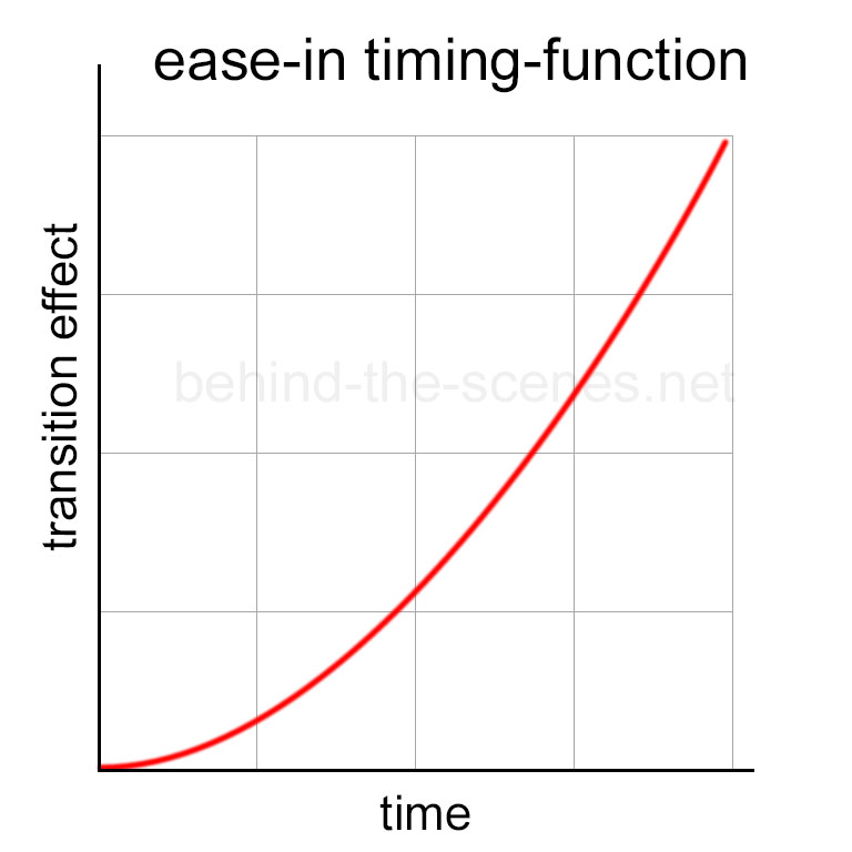
The ease-in timing function will make a transition start off slowly, and then accelerate until the end.
When a transition effect is plotted over time, the ease-in timing-function represented over time will look as follow:

Transition with the ease-in timing-function represented over time. The transition effect starts off slow, then accelerates towards the end.
The ease-in timing-function in action can be seen by hovering over the red area:
The ease-out timing-function
The ease-out timing-function makes a transition effect start quickly and then decelerate gradually until the end.
When a transition effect is plotted over time, the ease-out timing-function will look as follow:
The ease-out timing-function in action can be seen by hovering over the red area:
The ease-in-out timing-function
The ease-in-out timing-function makes a transition effect start quickly and then decelerate gradually until the end. It is similar to the ease timing-function, but with a slower start.
When a transition effect is plotted over time, the ease-in-out timing-function will look as follow:
The ease-in-out timing-function in action can be seen by hovering over the red area:
The linear timing-function
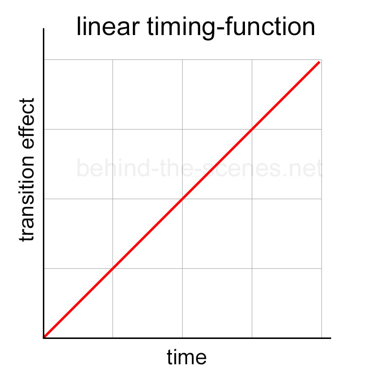
The simplest transition timing-function is linear. This means the transition will take place evenly over the given time. In other words, it will happen without any acceleration or slowing down, at the same speed.
When a transition effect is plotted over time, the linear timing-function will look as follow:

Transition with linear timing function represented over time. The transition effect starts and ends at an even pace.
The linear timing-function in action can be seen by hovering over the red area:
Other transition timing-functions
Other transition timing-functions that will not be discussed here include steps, step-start, step-end and cubic-bezier.
Multiple transition timing-functions
Transition timing-functions can also be used in combination:
transition-timing-function: ease, step-start, cubic-bezier(0.1, 0.7, 1.0, 0.1);
which will the following result:
Transition-delay property
The last CSS transition property is the transition-delay property. This optional property sets the amount of time (in seconds) the transition will take to occur.
As with the transition-duration property, delay values can either be set as full or fractions (e.g. 0.1s, 1.2s or 2s).
Using multiple CSS transitions
Multiple CSS properties can be transitioned in the same animation:
transition-property: width, height, background-color;
transition-duration: 2s, 3s, 4s;
or:
transition: width 2s, height 3s, background-color 4s;
Example uses of CSS transitions
Transitions are commonly used when hovering over input buttons. A transition can be used for color:, background-color:, font-weight:, width/height:, text-decoration:, etc.
In responsive design, transitions can also be used for elements to show and hide them off or from the screen. CSS properties in these cases include opacity and top/bottom/left/right positioning.
In a similar manner, CSS transitions can also be used as a delay for showing an element, e.g after a page has been loaded.
CC transitions vs. other CC animations
A transition is a change of CSS properties from one value to another value over a certain period of time. Unlike animations, transitions can’t change CSS properties themselves. Start and values can also not be defined.
CSS animations can change property types and property values by using keyframes. This means that CSS animations can change properties over many states. Among other things, start, middle and end values can be defined.
Translations (translate) can also be transitioned.
Notes and limitations
- Transitions will not work on IE 9 and earlier.
- Not all CSS properties, e.g.
displayandvisibility, will work with transitions. - Modern browsers already use CSS transitions. There is no need to use
-webkit-,-moz-or-o-. - The transition property will not work on the CSS height/width property if their sizes are unknown. I.e. if one of these values are set to
auto(default). This can be overcome by usingmax-height:andmax-width:.
A note on design
CSS transitions are great for adding some points of interest to a web page. They can function to add points of interest and a better user experience.
As with all animations, make sure that transitions are layout/design appropriate. One doesn’t want to, for example, use a radical, bouncy effect on a formal-looking website — except if that is the intended vibe.
Conclusion
CSS transitions are amongst the first types of ‘CSS animation effect’ many new CSS developers will come across. This JavaScript functionality allows elements to transition smoothly from one property value to another using the desired time interval.
CSS transitions are easy to use and understand and they can have a big impact on the look and feel of a web page.


